Editing Image Attributes
TypeMetal 2.1.2 features a modernized <img> attribute editor that helps you build content for today’s variable-resolution world. The updated editor helps you ensure that each image has appropriate resolution for its presentation size at a variety of possible scale factors, and enables you to provide alternate representations using HTML 5’s new srcset attribute.
In a WordPress Post or Page
Since WordPress handles providing resolution-appropriate variants of an image for you, TypeMetal presents a simplified inspector for <img> elements in a WordPress post or page. You simply choose the image you want, and let WordPress worry about the rest.
In a Standalone HTML File
When you’re editing a standalone HTML file, the attribute editor for an <img> element shows a row of “Image Resolution” indicators. These indicator buttons help you assess the adequacy of the referenced image files for the <img>’s presentation size at various possible display resolutions. They also offer actions you can take to modify the <img> as desired.

<img>
Each of the four indicators represents a display resolution that your content might be viewed on:
- “1x” indicates the display resolution that was common when the Web was born, which we think of today as a lower, legacy resolution.
- “2x” is the scale factor used by most of the high-resolution displays in use today, including most Apple Retina displays.
- “3x” is a higher-resolution scale factor used by Apple’s iPhone X and later.
- “4x” exists to support future displays of even higher resolution.
The indicator buttons are color-coded to help you check your image’s resolution status at a glance:
- Dim green indicates that the
<img>has exactly the right resolution for that scale factor, assessed at the<img>’s current presentation size. - Bright green indicates that the
<img>has more resolution than is needed for presentation at that scale factor and the<img>’s current presentation size. If optimizing download speed or minimizing use of download data is a concern, you may want to consider creating or providing a lower-resolution variant of the image for display at the given scale factor. Alternatively, you can change the<img>’s presentation size to match its available resolution. - Yellow indicates that the
<img>does not point to a file of sufficient resolution for that scale factor, at the<img>’s current presentation size. You’re unlikely to need to worry about this for 4x or even 3x, but if the 2x button is lit up yellow, you should consider providing an image file adequate to 2x display, or reducing the<img>’s presentation size to make the available image resource file(s) adequate.
Each of these resolution indicator buttons presents a context menu when clicked. The button’s context menu offers a list of actions you might want to take, based on the state of the <img> for that particular display scale factor:
- “Change presentation size to suit Nx image” changes the ” changes the
<img>element’swidthandheightattributes to make its presentation size appropriate to the given scale factor N. This is often the first edit you’ll want to make after inserting a new<img>element. - “Choose Nx image…” prompts you to choose an existing image file to use at the given scale factor N. Use this to provide an image file of sufficient resolution for a resolution indicator button that’s lit up yellow.
- “Choose a different Nx image…” prompts you to choose a different existing image file for use at scale factor N.
- “Create a downsampled, Nx copy” creates a lower-resolution copy of the image that’s sized for display at scale factor N. This action prompts you for where to save the downsampled copy and what to name it, and lets you specify the file type (JPEG or PNG) and compression options (if JPEG).
These actions provide convenient ways to automatically edit the <img>’s width, height, and srcset attributes. You can also add, edit, and remove those attributes directly, just as you would any others.
Editing srcset
The srcset property lists the additional representations that have been provided for the <img>, as alternatives to the fallback image specified by src. You can use the “+” and “-” buttons beside the srcset editor’s table view to add and remove representations from the srcset list, or you can edit the text of the srcset attribute directly. If you name your image files with scale-factor-indicating suffixes such as “@2x” or “-2x”, TypeMetal may be able to infer the appropriate scale factor for an added image file automatically. If this doesn’t work, or if you want to use width-based qualifiers such as “800w” instead of scale factor qualifiers such as “2x”, you can enter those directly in the table rows or in the srcset field.
In addition to presenting the relative URLs and resolution descriptors expressed in the srcset attribute, the image candidate list helpfully shows the pixel dimensions and sizes of the referenced image files.
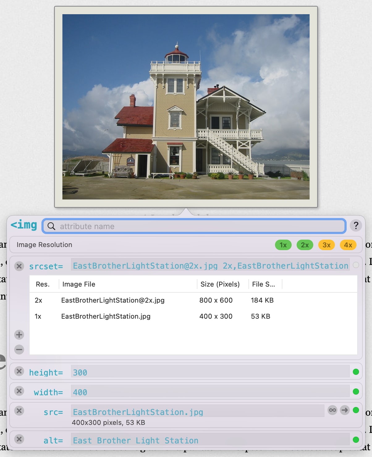
<img> Element That Specifies 2x and 1x Variants
Editing src
An <img>’s src attribute provides the fallback representation to use in browsers that don’t understand srcset, and can also be used alone without srcset in simple enough use cases. If you have an image suitable for display at 2x resolution, for example, and don’t want to bother providing a lower-resolution 1x copy of the image, you can simply specify the 2x file as the <img>’s src and be done with it. Use of srcset is optional.
The editor for the src attribute shows the attribute’s value in an editable text field, accompanied by some additional controls and file information, as pictured above.
The text below the src field indicates the image file’s pixel dimensions and size, if the file exists and can be read.
The buttons to the right of the src field make it easy to:
- choose a different image file (using the ∞ button to the right of the “src” field)
- open the referenced image file in another application (using the → button to the right of that button)
Editing width and height
Specifying an <img>’s desired presentation size via “width” and “height” attributes is optional, but is usually recommended. It’s important to do for images of 2x and greater resolution if you don’t use CSS syling to establish the presentation size of each <img>, since Web browsers ignore image file DPI metadata and instead default to using an image file’s pixel dimensions as its presentation size. Knowing these values up front also enables a Web browser to set aside appropriate layout space for an image before the image file to be used has even been downloaded.
You can specify an <img>’s width and height explicitly, or you can use the “Change presentation size to suit Nx image” resolution indicator button command described above to have TypeMetal choose appropriate values automatically.